
San Diego Magazine IG Refresh
This project repositions San Diego Magazine’s Instagram as a system more representative of its editorial authority. Developed during a social media design internship, the work introduces a modular, image-led template system now used natively across the publication’s feed. Working exclusively with the magazine’s established brand elements, the system prioritizes typographic hierarchy, legibility at feed scale, and editorial restraint. The project reflects my interest in brand systems, typography, and the strategic translation of institutional identity.
social media redesign
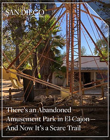
BEFORE


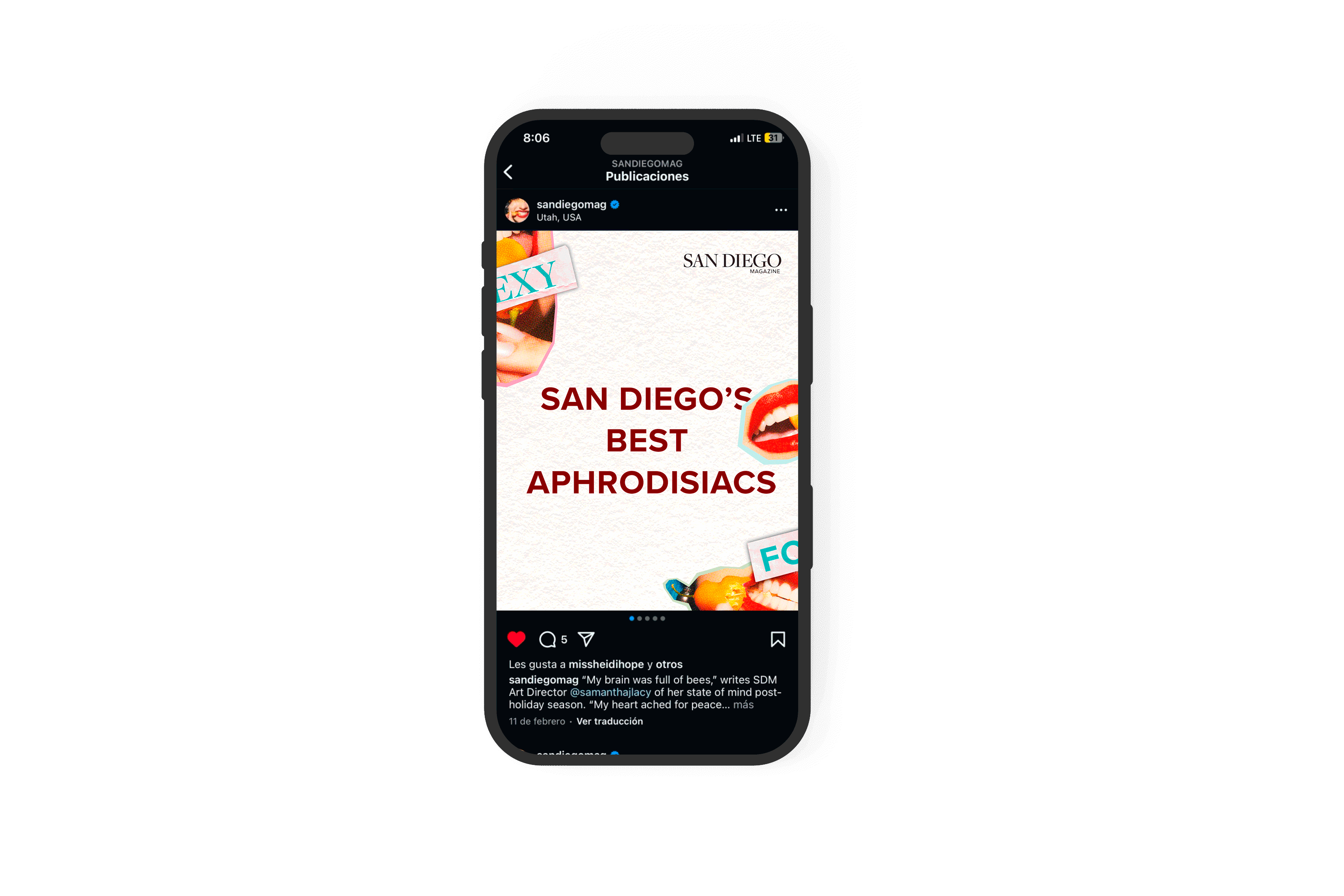
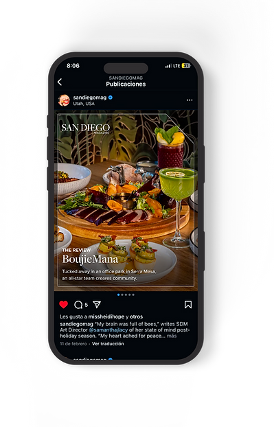
AFTER
Final Outcome


outcome

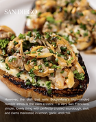


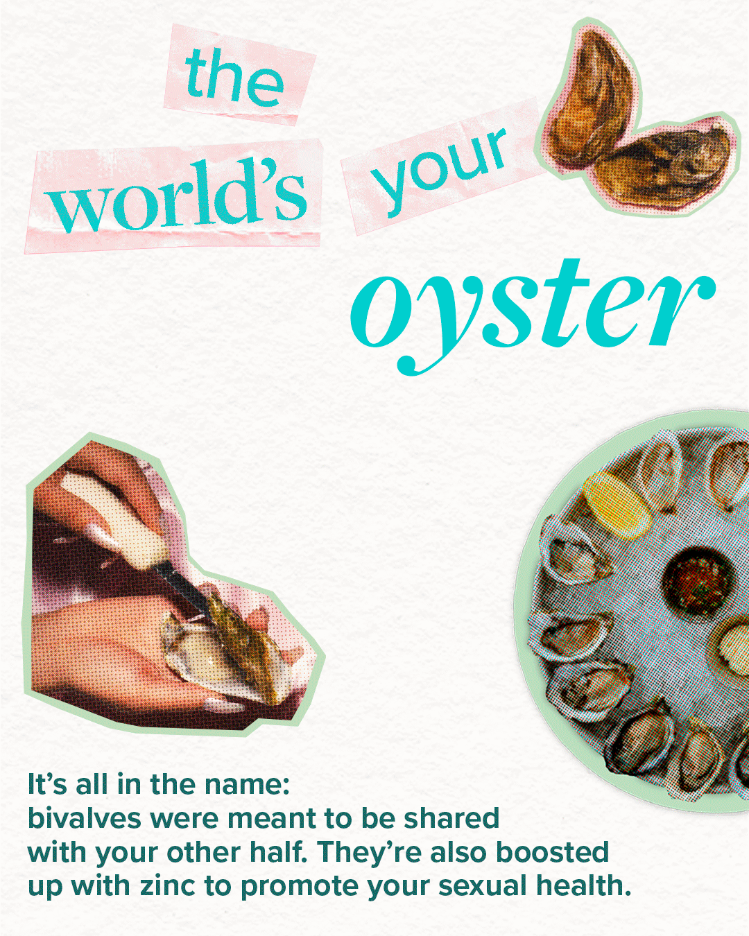
“SEXY FOOD” seasonal feature 1350x1080px
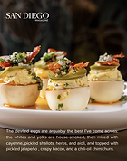
“THE REVIEW” core feature 1350x1080px
online promotional content


I assembled a seasonal ad system for San Diego Magazine’s New Year’s Eve promotion, delivering various layouts for hero headers, carousel spots, embedded web banners, etc. The assets shared one visual identity so the campaign felt cohesive no matter where a reader saw it, and the messaging stayed legible even in tight horizontal formats. This made it easier for the magazine promote the offer across its site without relying on generic vendor ads.
holiday card 2024

scripps stewardship report 2024
While at San Diego Magazine, I supported the Creative Director on the Scripps Stewardship Report, which is produced for Scripps Health and its donor community. I contributed page layouts and other visual refinements to ensure the report felt consistent, readable, and on-brand. This project was part of San Diego Magazine’s ongoing relationship with Scripps, one of its long-term clients in the local healthcare space.